Among Us UX Strategies
26 October 2020
Among Us UX Strategies
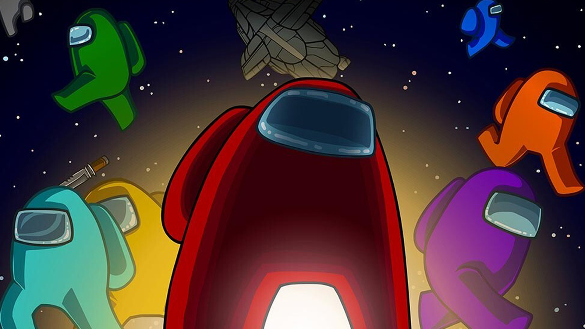
The current hot game for the past few months has been Among Us by developers InnerSloth. With it’s simple flash animated aesthetic and accessibility to multiple platforms, it has had a sudden growth spurt into the gaming world because of Twitch Streamers. I have been playing this game as well with friends for the past few weeks, and its refreshing to see other UX developers share similar concerns that I do while playing this game.
In this blog, we will be talking about an article that was recently published From tasks to tricks: the UX of Among Us. The article by Christian Paneda, highlights pros and cons of Among us from a UX persepctive.
Pros:
Use of sound for visibility and immediate feedback – gameplay has a satisfying sound and visual feedback.
Buttons with constraints to guide users – There are limited buttons (and even some disabled), so it prevents players from making too many errors.
Creative engagement of working memory is fun – By having a map be a main tool to find tasks to finish the game, it covers up most of the screen, forcing you to memorize where you are going.
No account needed = low barriers for participation – exactly this. Anyone can join.
Use of Fitts’s law for easy navigation of controls – easily clickable/touchable elements on the screen. Accessability and control over this too, helps people who may have trouble seeing or touching those spots.
Cons:
Affordance issues with some tasks – some tasks are much harder than others, and punish you more harshly by getting them wrong. Increasing your chance to get killed by the Imposter player.
Misleading information because of the large player base – Often the game throws errors while trying to get on a server. These errors mean nothing to the player because they are technical. Mostly they are caused by server stress.
Inefficient use of the periphery – the users avatar has limited vision while navigating the halls, making it hard to see everything in rooms.
Extra platforms needed for quicker communication – you need an additional tool like Discord if you want voice chat. There is ingame chat, but it is only text based.
I would like to note, I agree with most of what Paneda is saying in their article about feedback, strict button use, low barrier for participation, control navigation, etc. However, there are points I would like to make about cons, which hightlights the affordance issues with tasks and ineffcient use of periphery.
These two parts of the game, are intentional and can be controlled by the player who created the room. There are a lot of options to make the game more accessable to anyone and everyone, including the difficulty of tasks and the sight ability. I do know that when talking about visbility of the periphery, Paneda is referencing the full screen of the player view, but this is obviously intentional by the develepors at InnerSloth.
If players could see even more into rooms, it would ruin the game. The maps are limited, mostly labyrinth like in nature, and using the map as a tool is crucial to part of the gameplay, and if you take away turning the corner to see be able to see anything, you take away the mystery or scariness of the situation. Paneda does concede to this in their reflection on the bottom of the article, but wanted to highlight it anyway.
It is reassuring that other people are thinking about UX in every day things we interact with as much as I do. I encourage you to read Paneda’s article for further details and if you’re up to it, play some Among Us to see what all the buzz is about!